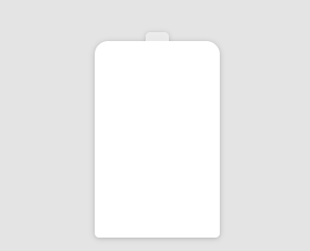
添加电池轮廓
<!DOCTYPE html>
<html lang="en">

<head>
  <meta charset="UTF-8">
  <meta name="viewport" content="width=device-width, initial-scale=1.0">
  <title>电池充电效果</title>
  <style>
    html,
    body {
      width: 100%;
      height: 100%;
      display: flex;
      background-color: #e4e4e4;
      overflow: hidden;
    }

    .container {
      position: relative;
      width: 140px;
      margin: auto;
    }

    .battery {
      height: 220px;
      box-sizing: border-box;
      border-radius: 15px 15px 5px 5px;
      filter: drop-shadow(0 1px 3px rgba(0, 0, 0, 0.22));
      background: #fff;
      z-index: 1;
    }
  </style>
</head>

<body>
  <div class="container">
    <div class="battery"></div>
  </div>
</body>

</html>

给电池加个帽,使用伪元素
    .battery::before {
      content: '';
      /*清除浮动*/
      position: absolute;
      width: 26px;
      height: 10px;
      top: 0;
      left: 50%;
      transform: translate(-50%, -10px);
      border-radius: 5px 5px 0 0;
      background: rgba(240, 240, 240, .88);
    }
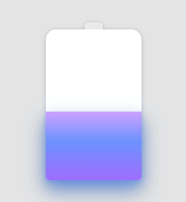
通过色块的位移动画实现充电效果
    .battery::after {
      content: "";
      position: absolute;
      left: 0;
      right: 0;
      bottom: 0;
      top: 90%;
      background: linear-gradient(to bottom, #7abcff 0%, #00BCD4 44%, #2196F3 100%);
      border-radius: 0px 0px 5px 5px;
      box-shadow: 0 14px 28px rgba(33, 150, 243, 0), 0 10px 10px rgba(9, 188, 215, 0.08);
      filter: hue-rotate(90deg);
      /*使用 filter: hue-rotate() 对渐变色彩进行色彩过渡变换动画*/
      animation: charging 6s linear infinite;
    }

    @keyframes charging {
      50% {
        box-shadow: 0 14px 28px rgba(0, 150, 136, 0.83), 0px 4px 10px rgba(9, 188, 215, 0.4);
      }

      95% {
        top: 5%;
        filter: hue-rotate(0deg);
        border-radius: 0 0 5px 5px;
        box-shadow: 0 14px 28px rgba(4, 188, 213, .2), 0 10px 10px rgba(9, 188, 215, 0.08);
      }

      100% {
        top: 0%;
        filter: hue-rotate(0deg);
        border-radius: 15px 15px 5px 5px;
        box-shadow: 0 14px 28px rgba(4, 188, 213, 0), 0 10px 10px rgba(9, 188, 215, 0.4);
      }
    }
效果如下:
阅读进度 0%

private note
交流
文章暂不开放公开评论。如果你有想法、问题或建议,欢迎私下联系站长。
联系站长